How to make MAC "visit" better?
MacOS uses "visit" to manage files. Many newcomers will feel that the visits to the default interface display and functional logic are not very easy to use. In fact, we can make "visit" better through some settings. Here is my experience.
修改默认打开时显示的位置The recently modified or open file is displayed when "Visit" is turned on by default. But this interface may make people feel a bit messy.
We can open the visit to preference settings (you can choose from the window menu bar, or press the shortcut "Command-comma). Set the "Turn on the New Visit Window" in "Universal" to other locations, such as I am set to display my current personal user file directory. You can also be set to desktop, document, iCloud cloud disk, or other specified folder.
This will open the visit to the default display is where you set.
调整边栏The left side of the window is "side bar".
Still visiting the preference setting, point the "Side Bar", here suggest that the personal user file directory is checked. Then it will display your personal collection in the side of the side. This makes it easy to open your user folder. You can also add "pictures", "movie", etc.
We can also manually drag some files to the "personal collection" of the sidebar, and then it will be like a shortcut. It is very suitable for placing some of the folders that we often open.
If you think that the icon and text display of the default side, you can modify the sideline icon size in the "System". But pay attention to this is global modification. That is to say, the sidebar icon of other apps will also be modified.
In addition, if you want to adjust the order of the border icon, you can use it as long as you drag.
I feel that these are not big deal. Don't worry, continue to look down ~ *
自定义工具栏Right-click or two fingers above the toolbar above the window, the "Custom Toolbar" will be displayed. You can add, replace the tool, or set the spacing between the tools according to your own preference.
The default toolbar only displays the icon. If you don't understand the function meaning of the icon, you can also select the "Icon and Text" in the toolbar settings. But I prefer to display only the icon, which looks more concise.
Also, hold down the Command key and drag the tool, you can adjust the arrangement of the tool in the toolbar.
从当前文件夹搜索We click the search box to visit the window to enter the keyword, then search results from the entire Mac disk by default. If you want to search only from the currently open folder location search, you can select "Search Current Folders" in the "Search Time". This is not only more accurate, but also faster.
If you want to temporarily search the entire Mac disk, you can display the "this MAC" on the left after entering the search word, showing a more complete result.
If you want to search for a type of file, you don't remember the file name. For example, if you want to find a PDF file, you can enter PDF in the search box, then click "Type", you will find all PDF files in this search location. You can also set the search criteria by clicking the plus below the search box to make a more precise search.
整理和排序For Mac newcomers, there is still a more unhappy thing to visit the files in the folder. Because the default we can manually place any file or folder location. But it is often easy to become very chaotic. And once the window is reduced, some files will be "hidden" in the original location, and you need to drag the scroll bar to see.
Here we need to understand the concept of MacOS "Order" and "Sort". Many people may know these two settings, but don't know what the differences have, in what circumstances are used.
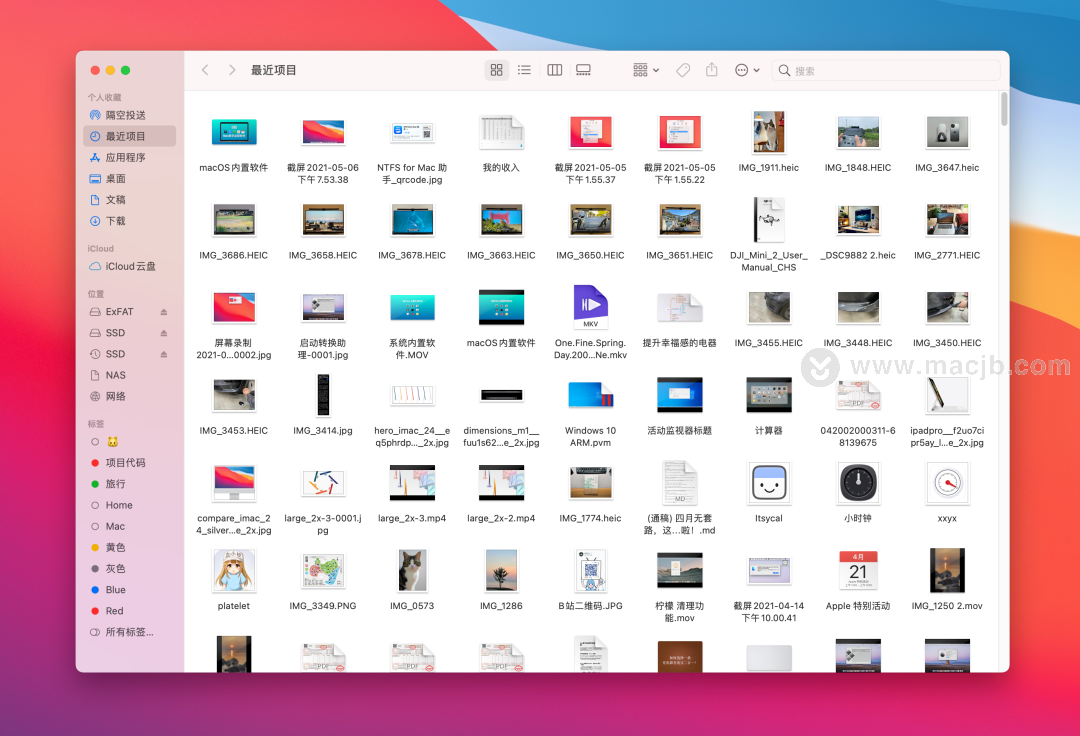
"Soligibility" can make the arrangement in the current file location layout, and there is a certain alignment, making the files not so messy. For example, some overlapping files are separated. But if the distance between the files is too large, it is still relatively large after finishing.
"Solving the way" allows all files to be neatly arranged in a certain rule, but you can still re-move your file or folder after finishing. And when the window size changes, the file will not be automatically adjusted. Still in the original position.
By the way, you can also quickly organize with shortcuts Command-Option. For example, Command-Option-1 is organized through the file name.
Here I recommend "sort mode" to display. We can sort according to the name, type, size, and add date of all items in the folder. After setting the sort method, even if we drag some items to other locations, it will not be moved. And when the window size changes, the project will automatically align. This seems neat in this way. And once the sort mode is set, the "finishing" and "finishing methods" on the menu option can be seen.
"Squiring" and "Sort" are two different philosophy. The array of "sorting" is static, which is to determine where a project is in. Although it is more flexible, it is easy to look into a mess. The alignment of "Sort" is dynamic, and it is completely handed over to Mac to arrange according to the agreement.
I personally prefer to use "sort" instead of "finishing".
If you want to display all the folders that open, you will be displayed in "Sort" by default, which is the way to set "Sort" in the global settings. You can open "View Display Options" in the Visit menu. Then select a sorting method and click on the bottom "used as the default" button. This way no matter which folder is opened, no matter how the window size is adjusted, the files inside are rinse.
After setting the global sort, if you want to use a separate folder, or different sort rules is also possible. It does not affect the global sorting rules for other folders.
图标显示If you want to make a smaller in the folder, you can change your COMMAND-minus or Command-plus sign.
Another way is to open the "View Display Options" under the current folder, you can set the icon size, but also include grid spacing, text size, and location, which display preview and file profiles can be set.
For example, check the "Show File Introduction" to see information such as the image size, video duration, and folder.
This setting will only modify the display in the current folder without affecting other folders.
If you want all open folders to use the same display mode. You can "used as default" after setting up.
显示状态栏和路径栏Click "Display" on the Visit to the menu, select the "Display Terminal", will display the path position of the current folder at the bottom of the window. Right click on the path or double pointing, you can also copy the path.
Click "Display" on the Visit to the menu, select "Show Status Bar", and display some of the status information of the current folder at the bottom of the window. For example, how many files (items) in the folder (project), how many files are currently selected, the disk remaining free space.
显示预览Now the top of the window is now, there are below the left and left. If you want to use the right side, you can display the preview on the right. In the Visit Menu - Display, click "Show Preview". The default display is blank. As long as any file or folder in the folder, the details of this file (clip) will be displayed at the right preview.
For example, the size, creation and modification of the folder. The size of the picture, etc. Open the "Preview Option", you can also select the color space, EXIF information, location information, etc. of the image. Especially when viewing a picture folder.
Visiting maybe we use MacOS to open the most applications. I believe that through these settings, you can make your visit to your usage habits while increasing the efficiency.
Latest: ZW32-40.5 35kV column vacuum circuit breaker profile size diagram - installation diagram
